Adding charts to the UI
You can add custom charts to the UI. Below is an example of adding a chart that displays historical and real-time CO2 sensor data.
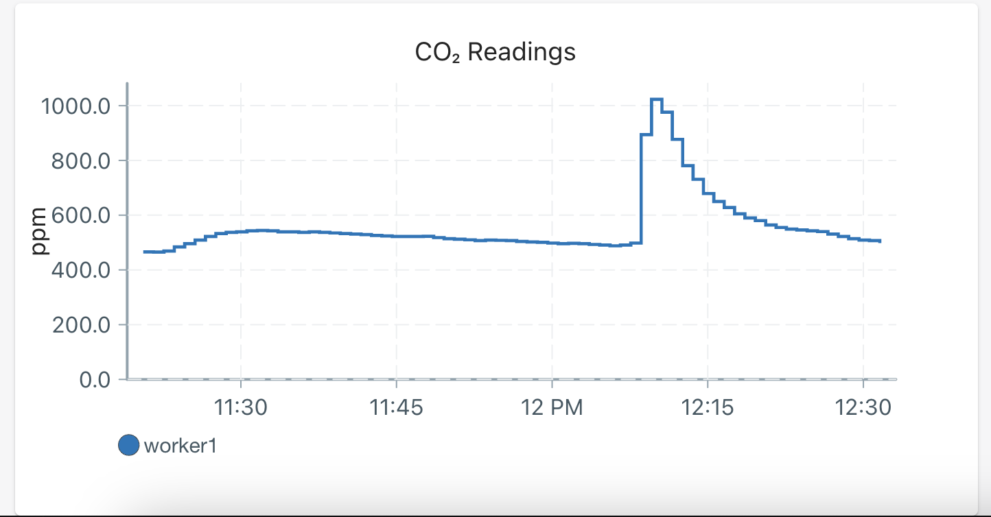
Chart YAML files go on the leader. The leader serves the dashboard, subscribes to live MQTT data for the UI, and reads historical data from the SQLite database.
If your data comes from a worker, you usually need three pieces:
- Worker-side code that publishes the reading to MQTT.
- Leader-side persistence that stores readings in a SQLite table, if the chart should show historical data.
- Leader-side chart YAML to make the chart available, and
[ui.overview.charts]config to include it in the default chart selection.
Step 1
Create a YAML file with the following fields, and place it on the leader in /home/pioreactor/.pioreactor/plugins/ui/charts/. Plugins can put the YAML file under ui/charts in their project folder; it will be copied to ~/.pioreactor/plugins/ui/charts upon installation. The installer also accepts ui/contrib/charts for legacy plugins.
chart_key: a unique identifier for the chart being added, string.data_source: the SQL table to read historical data from. The data source must have atimestamp,pioreactor_unit, andexperimentcolumn, along with a numeric column to plot (see below), string.data_source_column: the column indata_sourceto read and display, string.title: title on the chart, stringy_axis_label: the y-axis label, stringfixed_decimals: How many decimals to display, integer.mqtt_topic: a truncated MQTT topic to read live data from - stripped of thepioreactor/<unit>/<experiment>part. Ex:co2_readings/ppmif the entire MQTT topic ispioreactor/<unit>/<experiment>/co2_readings/ppm, string.payload_key: (Optional) If the MQTT topic is json blobs, use thepayload_keyto retrieve the data from the blob, string.interpolation: (Optional) the interpolation to use between points, default isstepAfter, string.y_axis_domain: (Optional) specify a starting y-axis domain. Must be an array, like[0.0, 0.5].y_transformation: (Optional) an inline JS function to transform the y data. Default is the identity function, string.down_sample: (Optional) A boolean to down-sample the data points from the server or not.
See examples of YAML files here and here.
Step 2
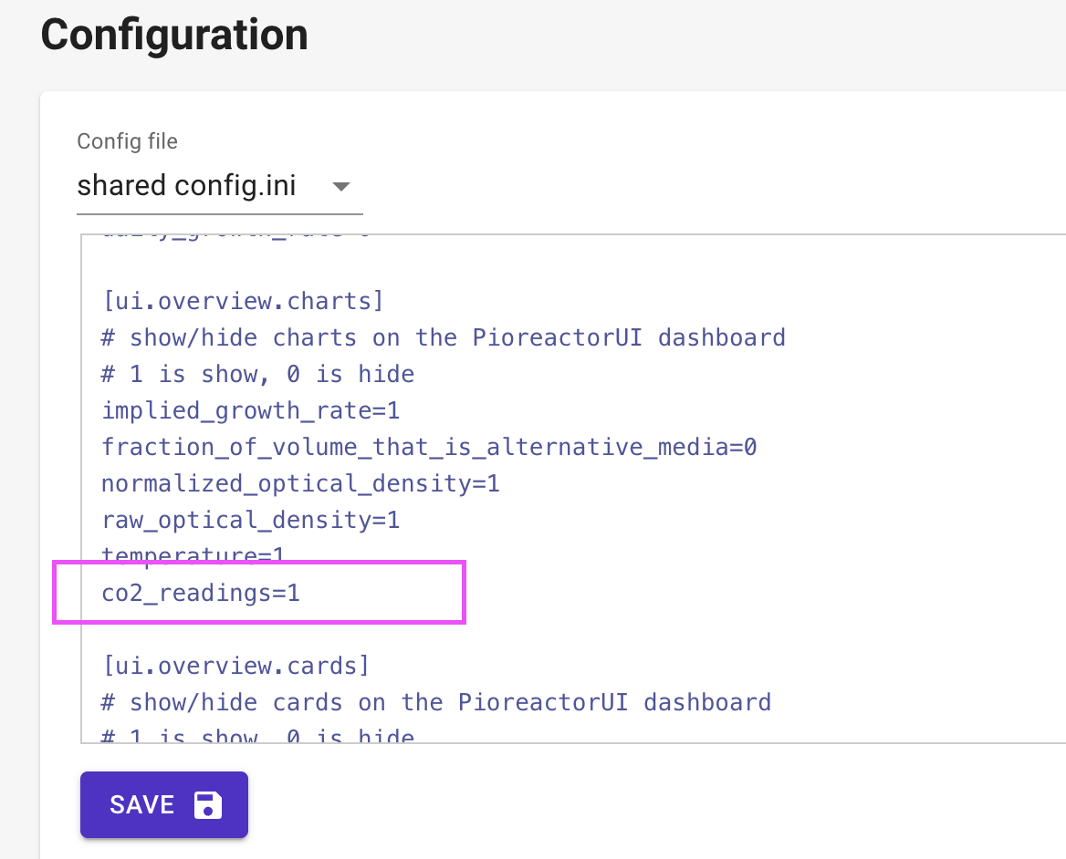
On the leader, add your chart key under [ui.overview.charts] in config.ini and assign it 1 to include it in the defaults. Example:
[ui.overview.charts]
# default chart selection for the Pioreactor UI
# 1 includes the chart by default; 0 leaves it available to select
...
co2_readings=1
...
Per-experiment chart selection
Users can select and reorder registered charts through Customize charts. Overview and individual Pioreactor chart views store separate ordered selections for each experiment on the leader. [ui.overview.charts] supplies defaults when a selection has not been saved; it does not restrict which registered charts users can select.
A new plugin chart is available in Customize charts even if its config value is 0. Changing the config defaults does not replace an experiment's saved selection. Users can select the new chart explicitly or choose Use defaults, then Save. See Choosing and ordering charts.
Troubleshooting
- If the UI stops displaying data, you may have introduced a YAML file that is not being read correctly. Check out the Pioreactor UI logs by sshing into the leader, and running:
tail /var/log/pioreactor.log
The last few lines should tell you about if a field is missing, a wrong type, etc.
- There is a 30 second cache, so it may take up to 30 second to see new changes in the UI.